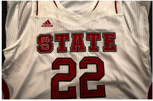
NC State unveils new basketball uniforms

The Twittersphere was active this afternoon as Coach Gottfried and some of his players posted pictures of NC State’s new men’s basketball uniforms. The good news is that the uniforms are going to be far more widely accepted than the infamous 2009-2010 attempt at a redesign that was unpopular to the extent of never being worn in action.

The following are links to some of the pictures:

Link to CJ Leslie

Link to Ralston Turner

Link to Rodney Purvis

Link to Lorenzo Brown and Scott Wood

About StateFans

'StateFansNation' is the shared profile used by any/all of the dozen or so authors that contribute to the blog. You may not always agree with us, but you will have little doubt about where we stand on most issues. Please follow us on Twitter and FaceBook

12-13 Basketball

39 Responses to NC State unveils new basketball uniforms

  1. mak4dpak 09/15/2012 at 7:03 AM #

    I really don’t see the problem with the new uniforms. Just something different, and sometimes we have difficulty with change. As for the bra comment, that particular area of the uniform doesn’t cover the chest, it goes over the shoulders, near the neckline, and besides that, we don’t see it on a body, which I am sure will look very differently too. But I think we can all agree, as long as they win, who really cares?

  2. LRM 09/15/2012 at 7:07 AM #

    LRM-approved. Subtle yet sharp.

    #completelyfreerodneypurvis

  3. Ed89 09/15/2012 at 7:55 AM #

    Ed approved. I like ’em. The mesh part is similar to what numerous “dry-fit” type shirts are going to these days. I like the Block S, the wolves, and the mesh portions. Opinions are like….though. Just win, and we’ll like ’em much more.

  4. JohnGalt78 09/15/2012 at 8:19 AM #

    We’re the red and white from Tate……..and we know we are the best. Bras across our chest, we will take on all the rest!

  5. Deucepeters 09/15/2012 at 9:07 AM #

    I think the new uniforms look great! Not sure about the howling wolves though. At least they’re subtle but the State brand is still a little muddled. Go Pack!

  6. 61Packer 09/15/2012 at 10:59 AM #

    I never understood why we needed to put “NC” on the basketball uniform in the first place, like we did in 1984 after winning the title in ’83.

    Now, after finally shedding the “NC” with last season’s “State” uniforms, we’re back again, trying to fix something that wasn’t broken in the first place.

    All I know is that I’d like to see the “NC” removed once and for all, and I also don’t want to see any more black uniforms, not even uniforms trimmed in black. Let Duke and UNC and Oregon and Maryland and whoever else who wants to tamper with their traditional colors do so, but we’re the Red and White, and let’s remain the Red and White of STATE.

  7. tlk1969 09/15/2012 at 11:50 AM #

    I actually like the block “S” on “STATE,” *but* the rest looks heinous!

    My first thought–like many others here–was that it looks like a corset or sports bra sewn onto a jersey! The red graphics on the shorts are pretty bad, too, but the jersey is shameful. Whoever designed this at Adidas is clearly the fan of a rival school. All that’s left is for our team to slap maxi-pads on the fronts of their shorts before they run onto the court!

    EDIT: We should definitely NOT wear black uniforms, period–in any sport. Simple, classic, red & white. . . That’s it. For all our teams. These attempts to make modern, “stylish” uniforms are futile. The results are highlighted above! If another example is needed, look to the Oregon football team. . . SIMPLE, CLASSIC, RED & WHITE!

  8. tjfoose1 09/15/2012 at 3:32 PM #

    From the school that brought you the unitard.

  9. ancsu87 09/15/2012 at 11:19 PM #

    I am sure they did vet the uniforms just not through SFN.

  10. OwenUnderground78 09/16/2012 at 9:02 AM #

    They’d look better on the womens team.

  11. 8pack 09/17/2012 at 12:59 AM #

    Whoa…Im no fashion expert (just ask my wife)…but damn, that’s an embarrassing uniform. I guess Cat Barber didnt see these before he chose us! Jeez.

  12. JaxPackMan 09/17/2012 at 9:18 AM #

    How do the Unis look on TV? All the criticism is about nit-picking stuff that will not show on the TV monitor. I would like to see the away model in red.

  13. john of sparta 09/23/2012 at 5:01 PM #

    from TV camera distance….two things:
    1. TATE.
    2. teddy.

  14. rexineffect 09/29/2012 at 6:15 PM #

    What eas said, plus it’s just the bandwagon standard issue Adidas uniform. What happened to the arched lettering? It works with the football jersey, but this looks bad.

    Can we veto this one like the
    NC
    STATE
    disaster of 2009?

Leave a Reply