Pro Combat Helmet designs

I thought you might be interested in this look at the Nike pro combat alternative helmet designs.

As an old fogey who prefers a more traditional look, I’m not a big fan of the garish, multi-colored uniforms that have become all the rage in college sports these days.

But the kids seem to like them. And unlike Maryland football coach Randy Edsall and athletic director Kevin Anderson, I understand that college sports should still be about “the kids.”

So it is with that in mind that I post this web site of Nike ProCombat helmet concept designs. There are several for each ACC school – even though they’re all not Nike clients – and they’re the work of designer Charles Sollars.

I’ll have to admit I even liked a few of them, including the maroon and gold Boston College helmet with the Eagle wing on it, the purple Clemson helmet with the oversized orange tiger paw on it, the Georgia Tech helmet with the big Yellow Jacket looking down from the top and the blue North Carolina helmet with the large footprint on it.

As for my least favorite, take your pick. There are too many to list.

I’m interested in seeing what you think of them. Which are your favorites? Which are your least favorites? Or would you prefer to see teams stay with the status quo?

You can scroll through all of the ACC’s alternative helmets by clicking here. NC State’s helmets start around #50.

As I scroll through all of the schools’ helmets, I genuinely think that NC State’s helmets probably look the WORST of all of the schools. I don’t know why our helmets didn’t translate better.

I also don’t know why ACC Insider chose to feature the three-headed dog Wolf design in their blog entry. I think that one may be the ugliest of the lot. (On second thought, maybe that is why it made the edit!)

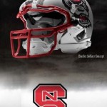
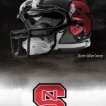
We would love your thoughts and observations on the helmets. The two NC State helmets below were my favorites. You can click on each picture for a better view.

About StateFans

'StateFansNation' is the shared profile used by any/all of the dozen or so authors that contribute to the blog. You may not always agree with us, but you will have little doubt about where we stand on most issues. Please follow us on Twitter and FaceBook

College Football NCS Football

Home Forums Pro Combat Helmet designs

Tagged: ,

Viewing 21 posts - 26 through 46 (of 46 total)
  • Author
    Posts
  • #55225
    hoop
    Member

    You guys must be a bunch of old fogey stogies. I like the 3 wolf design. It looks great on silver ut that on a black helmet and it would be tough as hell. Red might even work.

    I guess we can all agree that the block S looks good. I always hated that the regular S was confused with Stanford. And the diamond nSc just never looked right.

    #55226
    wolfbuff
    Participant

    Good idea, Yogi. Or to take the wolf eyes even further, make the face mask part of a snarling wolf mouth as well. That way when you’re looking at it face on, you’re looking into the face of a wolf.

    #55227
    IMFletcherWolf
    Participant

    Guys, chill out about the 3 wolves (drowned rats) logo. It is dropped and is no longer officially used. The guys who came up with these helmet designs did so on an unofficial basis.

    #55228
    Will NCSU
    Participant

    The best logo we have is on the wolfline. Looks like the old thundercats logo but with a wolf. It’s aggressive and clean.

    #55229
    Wulfpack
    Participant

    Is it just me when looking at Maryland’s state flag helmets that it looks like Friedgen just barfed up a jumbo-sized portion of lasagna on the helmet?

    #55230
    newt
    Participant

    I think the black with the red S looks good and I think the three wolves actually finally looks good on this style helmet. I have always disliked the three rats, but on this helmet, I think it looks good.

    #55231
    wolfpack15
    Member

    I know the players love this stuff and so do the recruited. So that means I do too. Plus it helps schools make more money on apparel sales. I would love to see us wear something like picture #54 or a flat black helmet with the block S on it in our opening game against Tennessee. Start the year off with excitement. We already saw what kinda confidence this stuff brings to plays with the red helmets last year and the black uniforms in football and basketball. I love the marketing idea behind it.

    #55232
    Red_Terrors
    Member

    So where’s the design with the old “diamond S” logo?

    I kid I kid…

    #55233
    YogiNC
    Participant

    I like the wolf face extending to the face mask. That would look awesome! Combined with blazing red eyes on the wolf…What a visual.

    Smarter than the average bear

    #55234
    Anonymous
    Inactive

    Can the basketball team wear red helmets with those black uniforms?

    #55235
    gumby
    Participant

    I don’t understand the ferocious animosity towards the 3-wolf design, but to each his own… it’s at least better than the Diamond NCS logo.

    #55236
    Lumpy
    Participant

    The “Tri-Weasel” is the worst logo ever created. I always associate that with some of NC State’s biggest sports marketing fails. Just below the unitard and the shoe contract with LA Gear. Bury it and burn the evidence. As far as the new helmets, I like the Strutting Wolf Head. It’s a legit logo with history and it looks good on the white white helmet and great on the red helmet. I also feel like this new wave of uniforms the colleges are getting are really gawdy. I think the kids who wear this stuff now are gonna look back at this stuff like I remember the Zubaz trend of the very early 90’s.

    #55237
    triadwolf
    Participant

    I thought a bunch of the concepts for the other schools looked pretty sharp, but I was not thrilled with any of the State designs. There’s some good ideas in this thread, but what was in that link looked amateur.

    #55238
    TN K-9
    Member

    I took a look at the SEC helmets. One of the UK helmets is a basketball – wow!

    LSU has a helmet similar to the one suggested by wolfbuff (wolf eyes with snarling wolf mouth). Looks good and I think a wolf head would work as well.

    Some was wondering where the UNC Old Well helmet is. Of course that would suggest a team representing an institution of higher learning. Therefore, I wonder where the helmet with a prison motif is. Perhaps some bars. Or they could go the NASCAR route and have Twitter sponsor a helmet.

    #55239
    Plz2BStateFan
    Participant

    I think the “tri weasel” or the “drowned rats” would look better if there were 18 of them instead of 3.

    Or just work with the block S.

    Hell I would be more afraid of a big closeup of Yow’s IAmNotFuckingAround face on the sides than anything. DESTROYER OF WORLDS!

    #55240
    Plz2BStateFan
    Participant

    The worst logo ever was the closeup of the wolf eyes a couple years ago.

    They had some shirts made with it. It looks like it has evolved into the cartoon version on our gloves and on the sides of CF field. But the real life version was HORRIBLE!

    #55241
    JSRy2k
    Member

    Duke’s are the worst. Hands down.
    Pitt’s pussycat was pretty weak as well. Meow…
    Florida State’s FSU diagonally looked cool.
    Clemson’s tiger paw ones were good.
    BC’s large eagle wing is sweet.
    Miami’s U-designs looked sharp.

    Generally speaking, mascots look poor on helmets. Bold letters or simple designs, such as Clemson’s tiger paw, UVA’s swords, FSU’s spear, or UNC’s heel (sorry), look best.

    #55242
    CPT_Pack
    Member

    I’d like to see us go back to the Diamond nSc logo like we used to wear in the Dick Sheridan days!

    #55243
    howlie
    Participant

    I didn’t like the ‘candy/lip gloss’ look of this year’s helmets. A matte finish would look better, with the ‘Block S’ being in the shiny/reflective finish.

    Regarding these helmets, generally, they look pretty cool. I don’t understand, however, if you’re going to all the trouble of putting the logo/decal across the facemask bar & fasteners [for continuity], why have a bright white chin strap snapped right over top of it all? At least go to the ‘background color’ of the helmet with the strap… that shouldn’t be too hard.

    #55244
    bTHEredterror
    Participant

    What became immediately apparent……is whoever did this is an Auburn fan. Jeebus!! Fiftleven Auburn helmets and one each for the B1G and XII.

    I kinda like the black with the Red Block S, and would be all on board for the wolf face.

    Of the other schools my faves were the Ilini Headress helmet and the hound’s tooth in the background of the traditional lookingBama numbers.

    #55245
    Dreadstone
    Member

    So God is feeling charitable and he pulls one unc fan and one NC State fan up to Heaven. “I’ll give each of you one wish – ” he begins before getting cut off by the unc fan.

    “Since chapel hill is ‘heaven on earth’ I want a 100′ wall to surround the city. Move my single-wide inside and make sure nobody can ever get in to ruin the ‘tar heel experience'”

    “Done,” God replies. He turns to the State fan. “Your turn”

    “So this wall, 100 feet tall”? God nods.

    “Impermeable to anything”? He asks.

    “Well, I AM God so yes”

    “Fill it with battery acid”

Viewing 21 posts - 26 through 46 (of 46 total)
  • You must be logged in to reply to this topic.